Report, key figures
Install
npx shadcn add @klarhimmel/report-statsUsage
import { Theme } from '@/components/klarhimmel/theme/style';
import { BlockSurface } from '@/components/klarhimmel/blocks/surface';
import ReportStats from '@/components/klarhimmel/blocks/report-stats';

export default function Section() {
  return (
    <Theme theme="brand">
      <BlockSurface>
        <ReportStats props={{
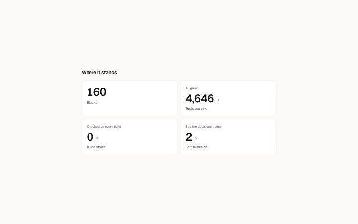
          "title": "Where it stands",
          "lead": "",
          "items": [
            {
              "value": "160",
              "label": "Blocks",
              "note": ""
            },
            {
              "value": "4,646",
              "label": "Tests passing",
              "note": "All green",
              "trend": "up"
            },
            {
              "value": "0",
              "label": "Inline styles",
              "note": "Checked on every build",
              "trend": "flat"
            },
            {
              "value": "2",
              "label": "Left to decide",
              "note": "See the decisions below",
              "trend": "down"
            }
          ]
        }} />
      </BlockSurface>
    </Theme>
  );
}
Install
Import
import Block from '@/components/klarhimmel/blocks/report-stats';- report/stats
- Category
- A document for a reader: key figures, decisions with a recommended default, long-cell tables, timelines, callouts, sources and prose. Rendered to one HTML file by kh-report.
Notes
When to use it
Two to six key figures at a glance in a report, each with an optional note and a direction. For figures on a marketing page use `stats-cards`, and when the numbers need a row-by-row comparison use `report-table`.
Writing for it
- The value allows only 24 characters, so write 42 %, 3.1 s or 12 000 and move units and context into the label (60 characters). - Use trend only when direction is the point. Up, down and flat add an arrow and a screen-reader word but do not say whether the change is good, so say that in note (100 characters). - You need at least two items and at most six. Three, five and six figures lay out in threes on wide containers, while two and four lay out in twos.
Watch out for
A figure needs two or more items, and the value box wraps anywhere, so a long value still breaks mid-word instead of overflowing. Keep it short anyway, because a trend arrow is placed after it and the screen reader hears the label before the value.
Pairs well with
Usage
The block in a page, with its default content (long lists shortened). Every prop is in the table below.
import { Theme } from '@/components/klarhimmel/theme/style';
import { BlockSurface } from '@/components/klarhimmel/blocks/surface';
import ReportStats from '@/components/klarhimmel/blocks/report-stats';

export default function Section() {
  return (
    <Theme theme="brand">
      <BlockSurface>
        <ReportStats props={{
          "title": "Where it stands",
          "lead": "",
          "items": [
            {
              "value": "160",
              "label": "Blocks",
              "note": ""
            },
            {
              "value": "4,646",
              "label": "Tests passing",
              "note": "All green",
              "trend": "up"
            },
            {
              "value": "0",
              "label": "Inline styles",
              "note": "Checked on every build",
              "trend": "flat"
            },
            {
              "value": "2",
              "label": "Left to decide",
              "note": "See the decisions below",
              "trend": "down"
            }
          ]
        }} />
      </BlockSurface>
    </Theme>
  );
}
Props
The type, default and text limit of every prop. On a real page, over-limit text is kept and checkSections flags it (Installation, Check a page before you ship); this live preview shows the default until it fits. The panel above edits all props.
| Prop | Type | Default | Description |
|---|---|---|---|
title | string | 'Where it stands' | Text, up to 100 characters. |
lead | string | '' | Text, up to 300 characters. |
items | { value, label, note, trend }[] | 4 items | List of 2 to 6. Each item: value, label, note, trend ('up' | 'down' | 'flat') (optional). |
headingLevel | '1' | '2' | - | One of '1', '2'. Optional; empty is not rendered. |